
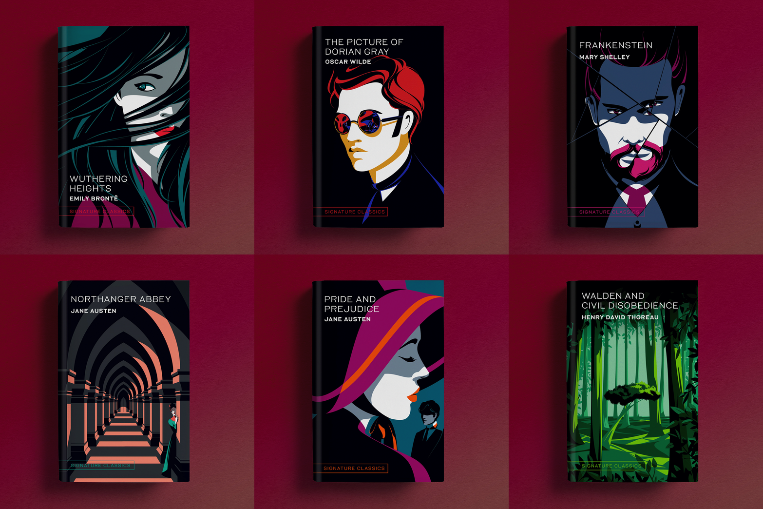
This series was created over the course of about 5 years, illustrated by the incredibly talented and patient Malika Favre. Each cover was printed in 5 colors with a soft-touch laminate to make the blacks as flat and rich as possible. This is just a selection of the 40+ beautiful covers Malika created for the series, all featuring the UNSQ font created for the house by Nigel Brody’s team at Brody Associates. This project was a highlight for me, even tho all I really did was hire Malika and Nigel to make it happen.
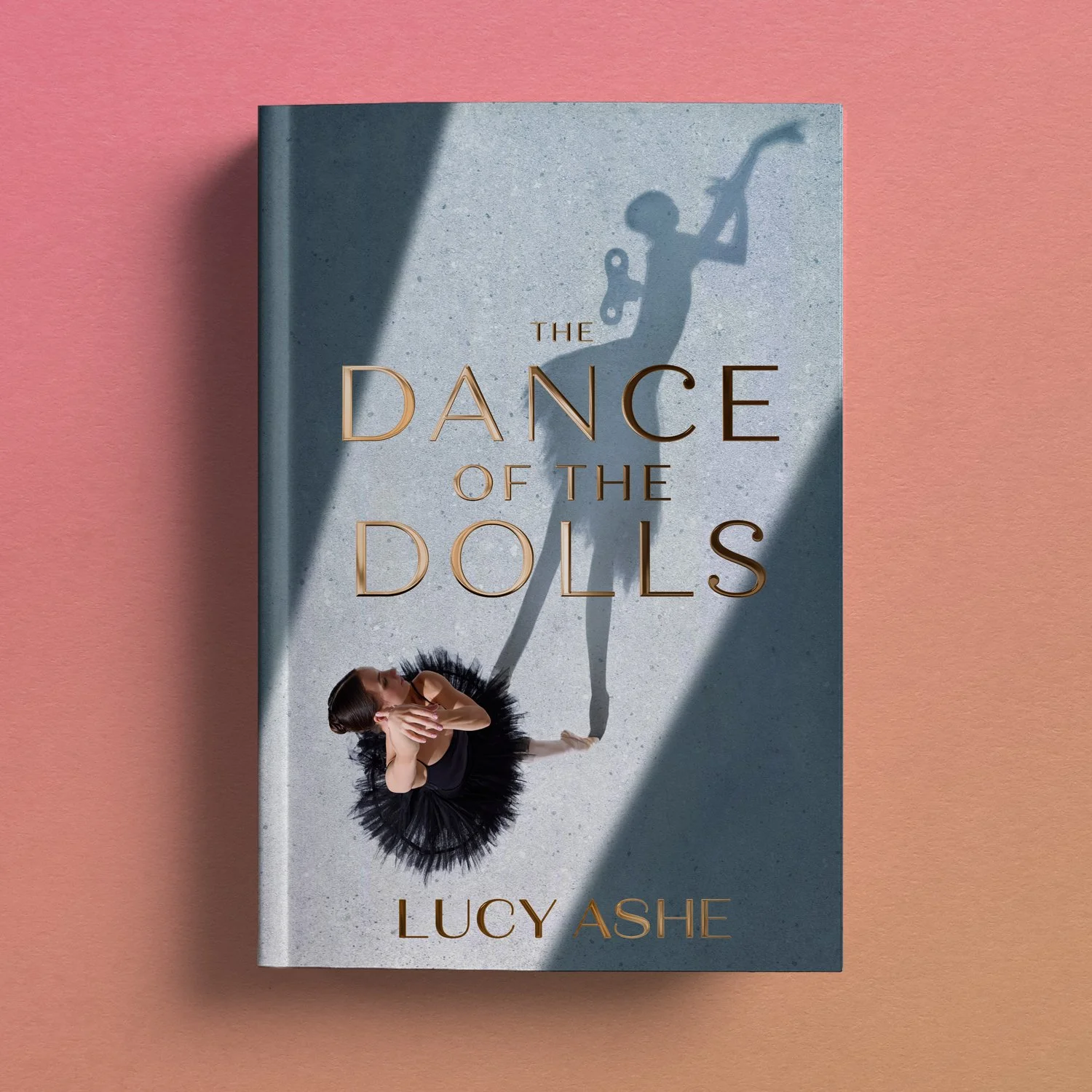
This creepy thriller takes place behind the scenes of a ballet that features a life-sized wind-up doll, twin ballerinas, a cobbler, and an obsessed stalker. What more do you need? Photo by Anton Vierietin.
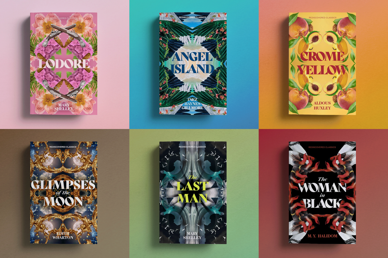
UNSQ’s Rediscovered Classics line features kaleidoscopic collages made using various microstock and public domain images.
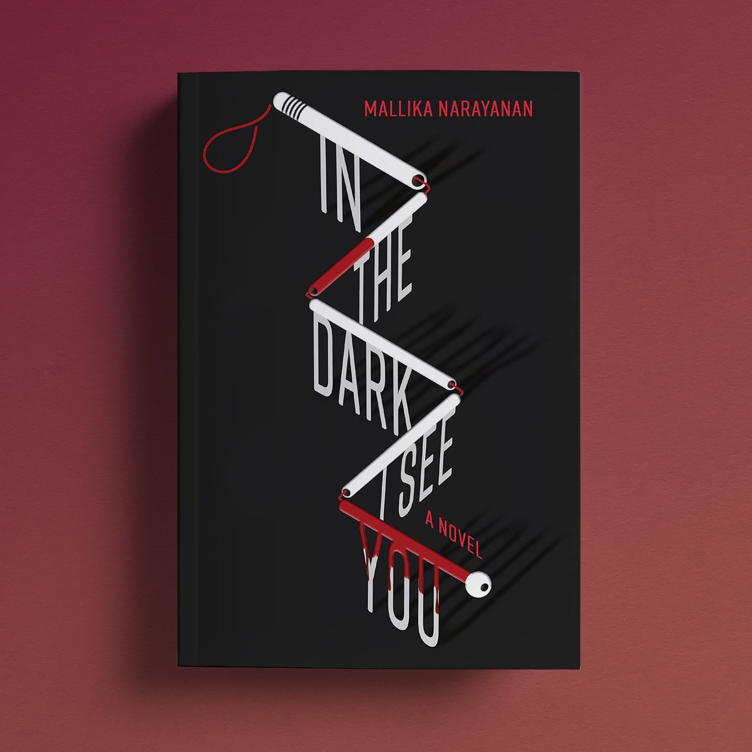
This is the story of a blind female detective being stalked by an ex-rival. It’s full of twisty turns and I thought the folding cane—which she uses throughout the story—was a perfect device to help illustrate all the angles of the storyline.
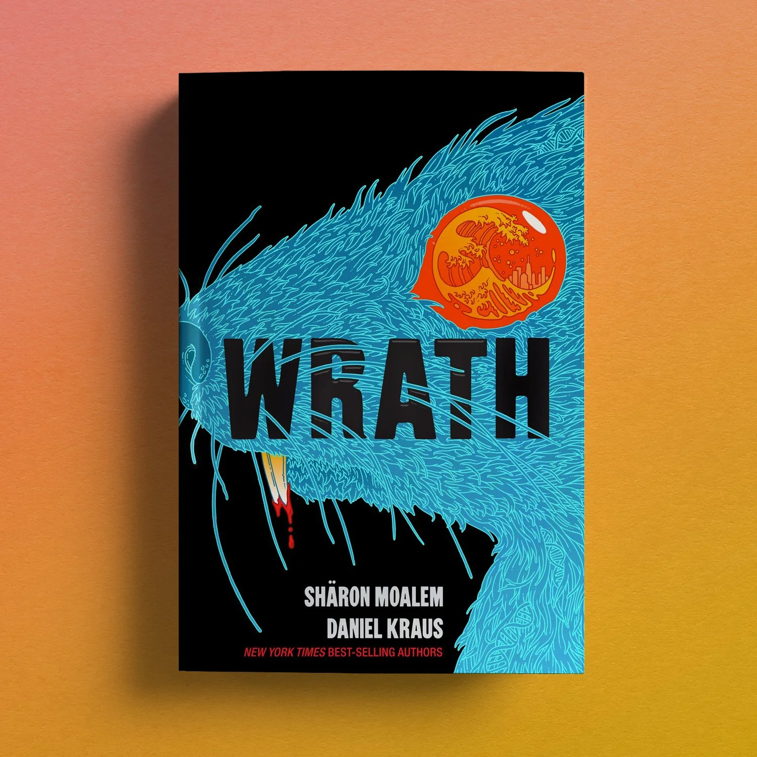
This super creepy cover was illustrated by my fave Eric Nyquist, who—along with the authors—also created endsheets and a back cover illustration that contain a secret code that I will not divulge, you’ll just have to work it out on your own. 4/C with a spot uv just on the eye, and the R-A-T of the title.
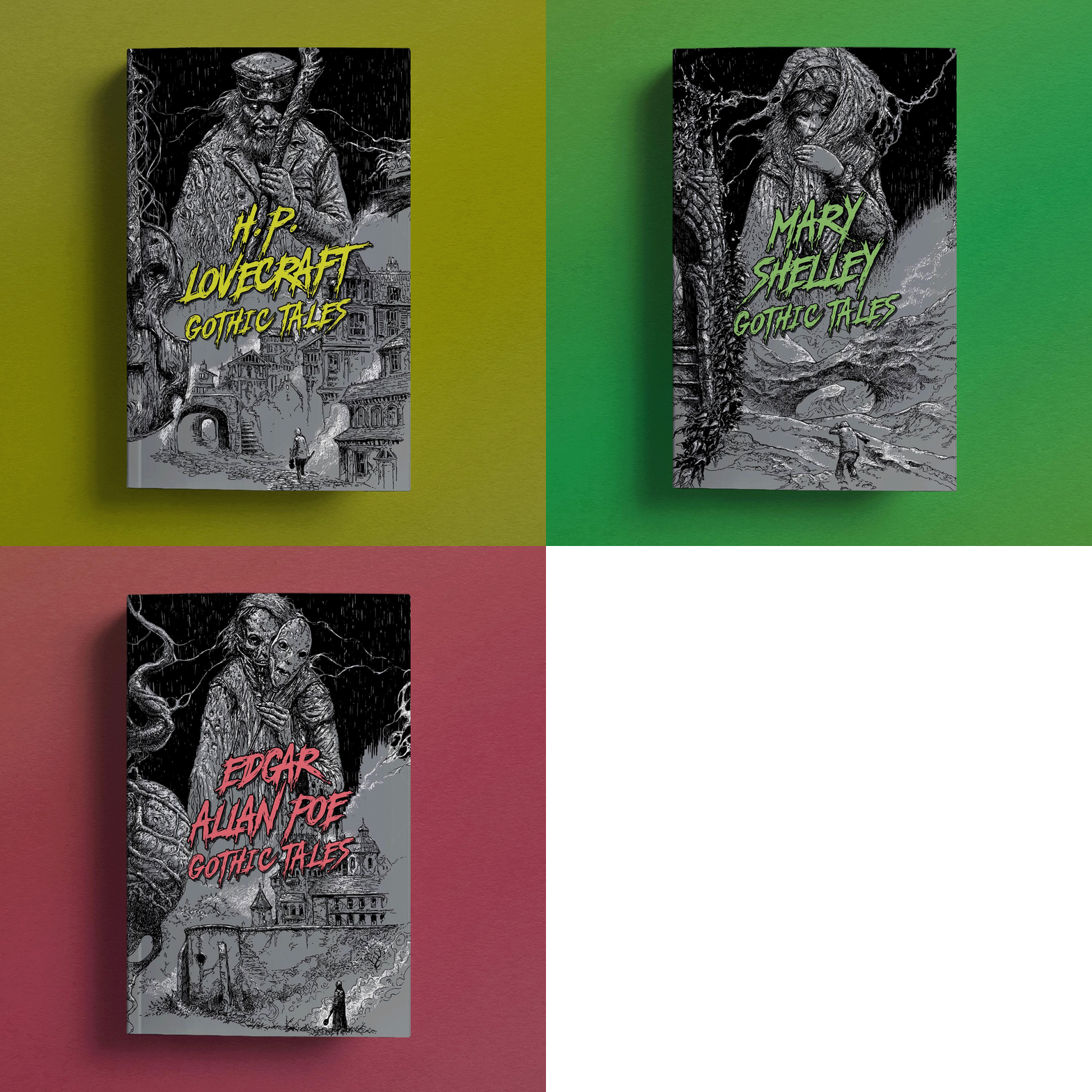
These 64-page chapbooks feature illustrations by Dave Kendall, and are printed in three colors: black, silver metallic ink, and varying neon inks. Dave is a dream to work with and squeezed these in between several large paintings he was working on for Magic: the Gathering, which made me feel cool just by association.
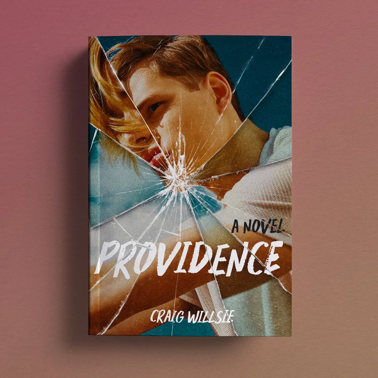
Cover photo from Offset; effect from Envato
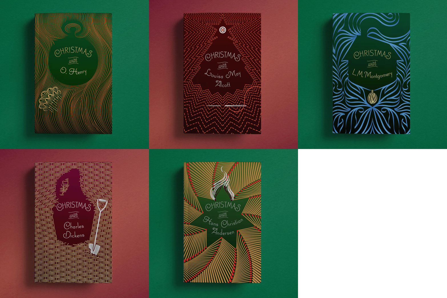
These 64-page chapbooks feature patternwork illustrations by the wondrous Yehrin Tong, printing in 4/C with foil accents and a soft-touch laminate. For this series, we wanted the voids in the patterns to be just as meaningful to the composition of the covers as the patterns themselves.
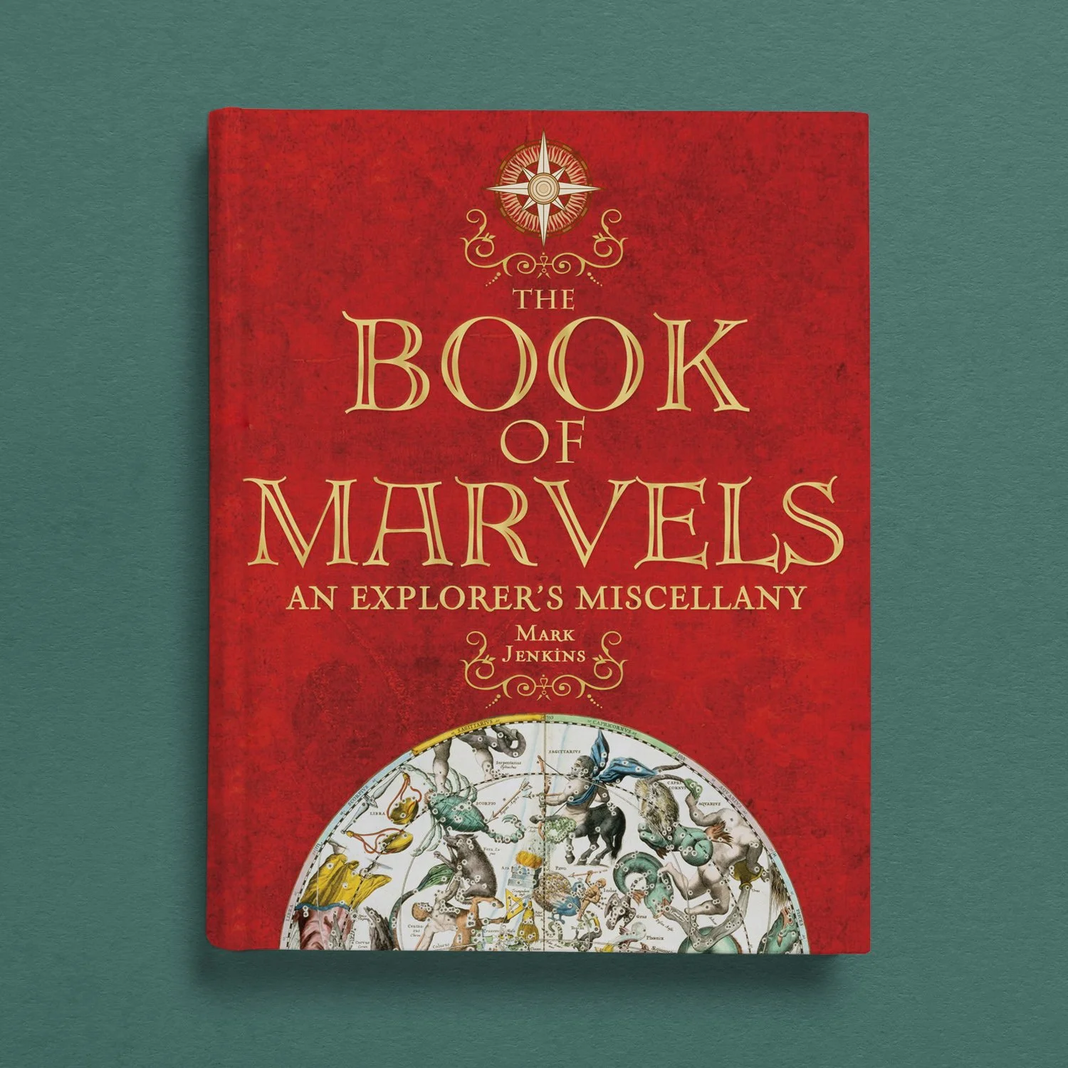
These classic tales of exploration didn’t have much of a budget, so the book has a faux-leather photographic background and a fake foilstamp on its cover, which I still regret to this day.
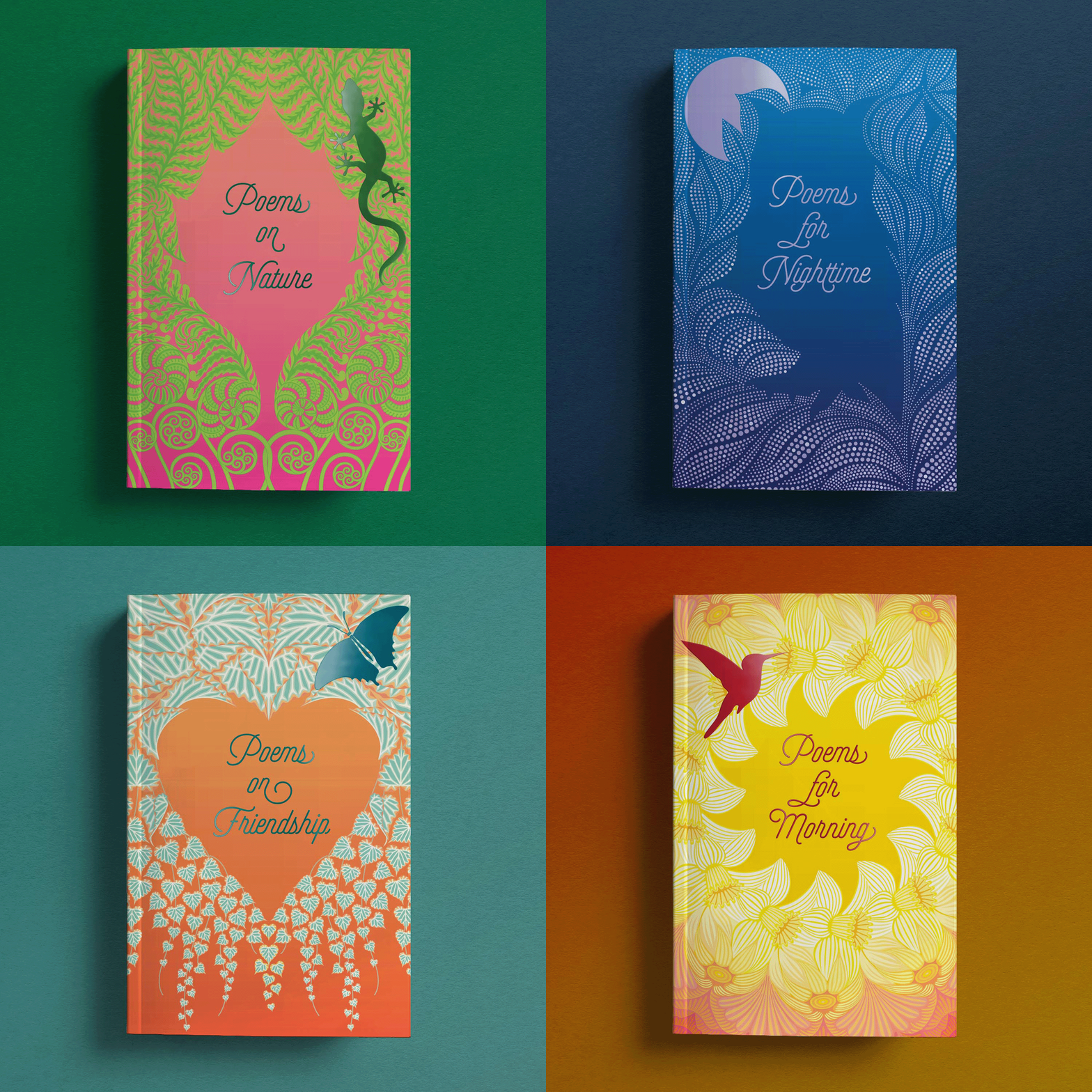
These 64-page chapbooks feature illustrations by the wondrous Yehrin Tong, printing in 4/C with foil accents. There is an owl who lives in my yard and I think Yehrin really captured its creepy, looming energy.

Classic correspondence from literary loves, greats, philanderers, and heartbreakers.
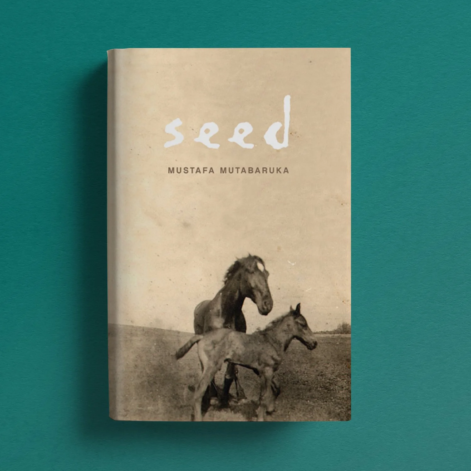
This is a crazy old cover, but I’ve always had a soft spot in my heart for the photo, which the publisher found in a thrift store.